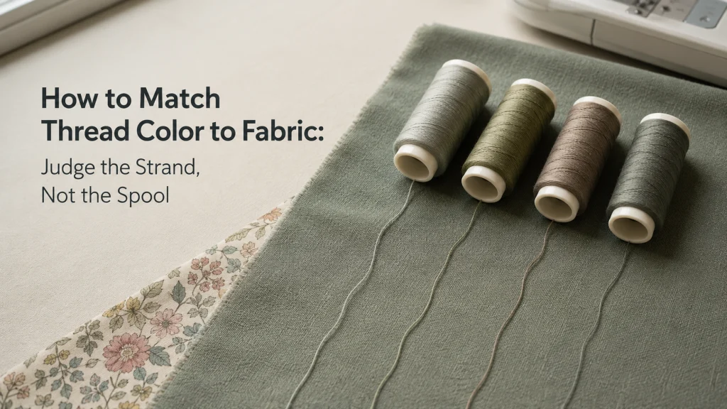
Matching thread color works best when you judge the thread as a single strand against the actual fabric, not as a dense block of color on the spool. First decide whether the stitches should blend into the fabric or show on purpose, then compare a few candidate strands under the light in which the project will normally be seen. Printed fabric needs one extra decision because the thread cannot match every color at once. There is no universal rule that the correct choice must always be one shade lighter or one shade darker.
The spool is a bundle, but the stitch is a strand
If you are learning how to match thread color to fabric, the spool itself can be misleading. Dozens of wraps sit side by side on the spool, so the color looks denser and often darker than one strand will look against cloth. A candidate that seems too dark in the rack can become much less noticeable once a short length is pulled free and laid over the fabric.
This is a color-selection decision, not a substitute for choosing the correct thread construction for the sewing job. If fiber, size, or general-purpose suitability is still unresolved, start with choosing the right sewing thread type and then return to color. For the broader relationship between thread and other machine-sewing supplies, matching sewing supplies to the project provides the wider decision context.
Decide whether the stitch should blend or intentionally contrast
Color cannot be judged as right or wrong until the stitch has a visual job. Construction stitching, edge stitching, visible topstitching, and machine quilting may all place the thread differently on the surface. A close match is useful when the goal is to keep the stitch quiet, while a deliberate contrast can be appropriate when the line of stitching is part of the design.
| Desired result | What to compare | What should reject a candidate |
|---|---|---|
| Blend into the fabric | Single strands that disappear or become visually quiet on the target area | A strand that creates an obvious light-dark or warm-cool edge |
| Subtle visible stitching | Nearby colors that remain readable without dominating the fabric | A contrast strong enough to pull attention away from the intended project detail |
| Intentional contrast | Colors that remain clearly distinct from the fabric at normal viewing distance | A near-match that weakens the intended stitch line |
Make this decision before comparing shades. Otherwise, a color can look like a poor match simply because you have not decided whether the thread is supposed to disappear or be seen.
Pull a single strand across the actual fabric
Take a short length from each candidate spool and lay the strands directly on the project fabric. Do not hold them several inches above the cloth, and do not judge only from the spool caps or printed shade names. The useful comparison is the actual thread against the actual surface it needs to coordinate with.
| What you are looking at | What the color can tell you | How to use it |
|---|---|---|
| Thread on the spool | A dense bundle that can look darker or stronger than one stitched strand | Use it only to narrow the candidate colors. |
| One strand on the fabric | The closest practical preview of how the color will sit against the cloth | Use this comparison to make the final visual choice. |
Threads Magazine specifically recommends unrolling candidate threads, laying them over the fabric in natural light, and deciding which one blends best. That is a useful evidence anchor because it tests the form the thread actually takes on the project instead of treating the wound spool as the finished appearance.
- Use the same fabric piece or a representative swatch for every candidate.
- Lay several close shades side by side instead of relying on memory between comparisons.
- Move the strands across more than one area if the fabric shifts in color or value.
- Step back briefly when the goal is blending, because a match can look different at normal viewing distance than it does inches from the fabric.
If color is the only unresolved variable, this strand test is more useful than buying a different thread type solely because its shade looks closer on the spool. When general-purpose thread is the intended construction choice, all-purpose sewing thread selection should remain a separate decision from color matching.

Gütermann Sew-All Thread Set contains 20 spools of all-purpose polyester sewing thread in assorted popular colors, with 100 meters on each spool. The thread is designed for both machine and hand sewing and can be used for closing seams, quilting, and decorative stitching. Gütermann uses its Micro Core Technology construction and recommends universal needles in sizes NM 70 to 90.
Check On AmazonIf you click this link and buy, we earn a commission at no additional cost to you.
Check value and hue under relevant light
Two threads can belong to the same general color family and still behave differently on fabric. One may be too light or too dark in value, while another may lean warmer, cooler, redder, bluer, or more muted than the cloth. When the goal is blending, either difference can make a stitch line more visible even if the shade name sounds correct.
Lighting can also change the comparison. A strand that appears close under warm indoor light may separate from the fabric near a bright window, while a cool lamp can shift the apparent balance in another direction. If the finished item will normally be seen in more than one environment, check the same candidate under the relevant lighting rather than trusting a single store display.
Key point: Compare the thread by the visual result on the fabric. Shade names, phone photos, monitor colors, and spool labels can help narrow the choices, but none of them replaces the strand-on-fabric check when you have the material in hand.
This is also why an exact catalog color number is not necessary for every ordinary seam. If two strands both become visually quiet on the target fabric, the practical difference may be negligible for a hidden or low-visibility stitch.
Handle prints by choosing the area or stitch role that matters
A multicolor print creates a simple problem: one thread cannot match every printed color at the same time. Start by identifying where the stitching will be visible and which part of the print controls the appearance there. For a seam that crosses mostly through a dark background, a strand that blends with that background can be more useful than one matched to a small accent color.
For a busy print with no single dominant area, audition one strand across several parts of the fabric. A neutral or muted candidate may visually recede across more of the print than a thread that perfectly matches only one small motif. The choice still comes from observation on the fabric, not from a rule that every print must use the background color.
The same method works when one seam crosses several different fabrics in the same project. Lay the candidate strand across each fabric it will actually cross, then decide which area matters most visually. If no single shade disappears everywhere, choose the one that stays least distracting across the important surfaces rather than forcing an exact match to only one piece.
Visible quilting changes the purpose again because the stitch line may be intended to contribute texture or contrast across several colors. If quilting visibility is the main decision rather than ordinary color matching, compare machine quilting thread choices in that specific context. The color decision here stays focused on selecting a strand for the fabric already in front of you.
Refuse universal lighter-versus-darker rules
You will encounter advice to choose a slightly darker thread when an exact match is unavailable. That can work on many fabrics, but it is not a law. Threads Magazine notes an exception for pale, fine fabrics where a lighter option may disappear better, which is enough reason not to turn the darker-shade shortcut into a universal instruction.
The better rule is procedural: compare the closest candidates as individual strands and choose the one that produces the intended visual result. On a medium solid, the darker candidate may recede better. On a pale fabric, the lighter candidate may be less noticeable. If you want contrast, neither one should be judged by how well it disappears in the first place.
That distinction also prevents color selection from drifting into a claim about sewing performance. A strand can look better on the fabric without being the correct fiber or size for the machine, needle, seam, or project. Color comes after those compatibility and use questions, not instead of them.
Final Thoughts: judge the stitched strand, not the spool
Thread color matching becomes much easier once the decision is reduced to what the stitch should look like on the actual fabric. Decide whether the line should blend or contrast, pull a single strand from each likely spool, and compare those strands where the stitching will appear. Check more than one light if the project will be seen in different environments.
Do not let a one-shade-lighter or one-shade-darker shortcut override the evidence in front of you. The correct choice is the strand that gives the intended visual result while the thread itself remains appropriate for the machine-sewing job. That keeps color selection practical without turning a useful rule of thumb into a rule that fails as soon as the fabric changes.
Frequently Asked Questions
🧵 Should sewing thread be lighter or darker than the fabric?
Neither is universally correct. Lay the closest candidates as single strands on the fabric and choose the one that blends best, or the one that gives the contrast you intentionally want.
🎨 How do I match thread to printed fabric?
Identify the part of the print where the stitch will be most visible, then audition the thread across that area and several nearby colors. A useful match is often the strand that stays visually quiet across the relevant portion of the print, not the one that perfectly matches a tiny accent.
💡 Why does my thread look different at home than in the store?
Lighting can change the apparent value and hue of both thread and fabric. Recheck the strand on the actual fabric under the lighting where the finished item will normally be seen.
🪡 Can I match thread color by looking at the spool?
The spool can narrow the choices, but the wound thread looks denser than a single strand. Pull a short length from the likely candidates and compare those strands directly on the fabric before deciding.
👗 Does construction thread need to match fabric exactly?
Not always. If the stitching is hidden or low visibility, a close visual match may be sufficient as long as the thread itself is appropriate for the fabric, needle, machine, and seam.
References and Sources
These sources support the strand-on-fabric comparison method and the limits of universal lighter-or-darker advice used in this article.
- Threads Magazine thread essentials: Supports comparing unrolled thread on the fabric in natural light and explains why darker-thread advice has exceptions.
- Superior Threads color guidance: Demonstrates how a single strand can visually blend differently from the same color viewed as a wound spool or cone.
Only the visual-selection points used above are carried into the article; brand-specific product recommendations are not part of this color-matching decision.